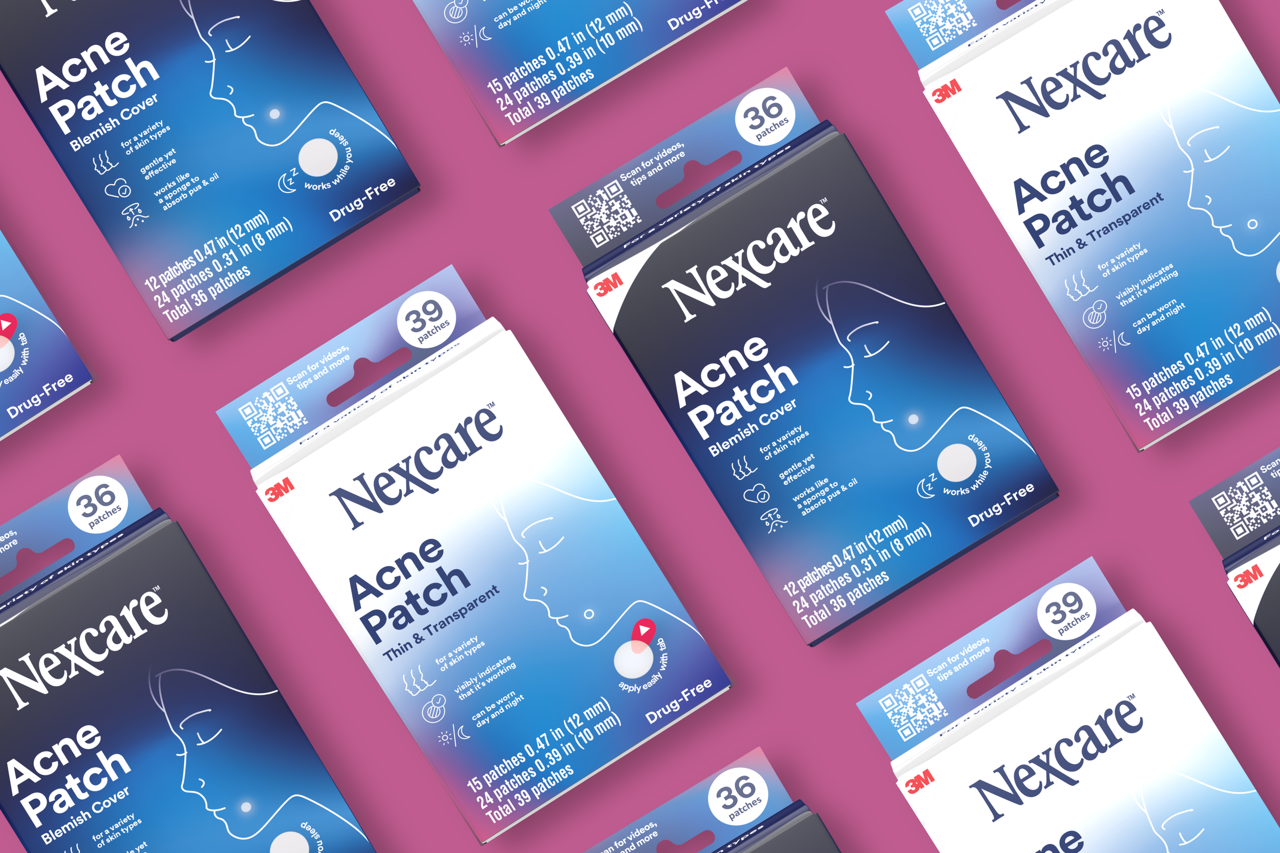
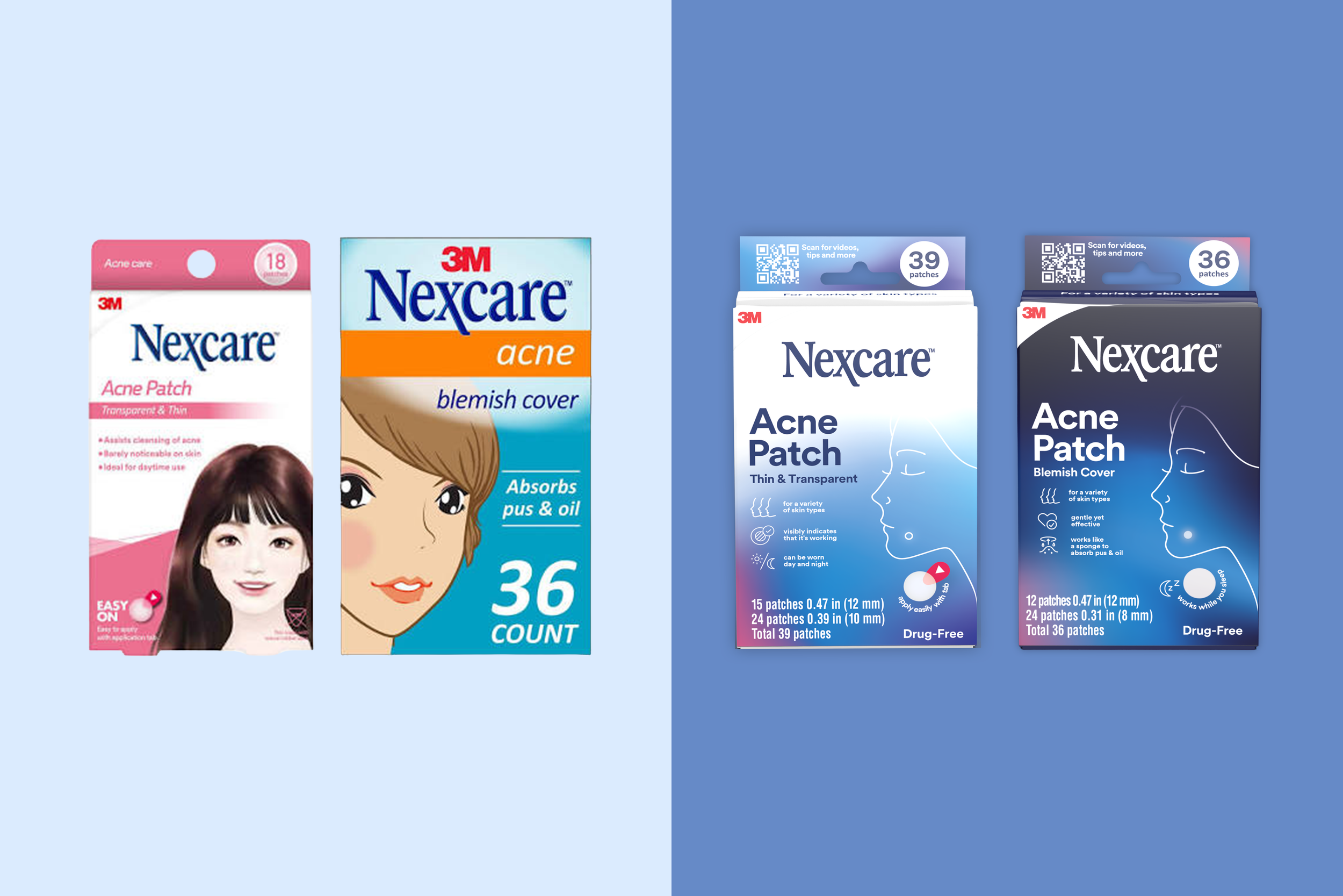
We leveraged benefit icons to clearly showcase our unique technology, creating immediate visual cues that communicate value at a glance. The color palette was refreshed for a cleaner, fresher look and feel—streamlined hues and improved contrast enhance readability and modernize the brand. The updated face has been redesigned to be more generic and treated as an artful element, allowing it to support messaging without dominating it. Together, these changes improve visual hierarchy, strengthen brand consistency, and make complex information more approachable.