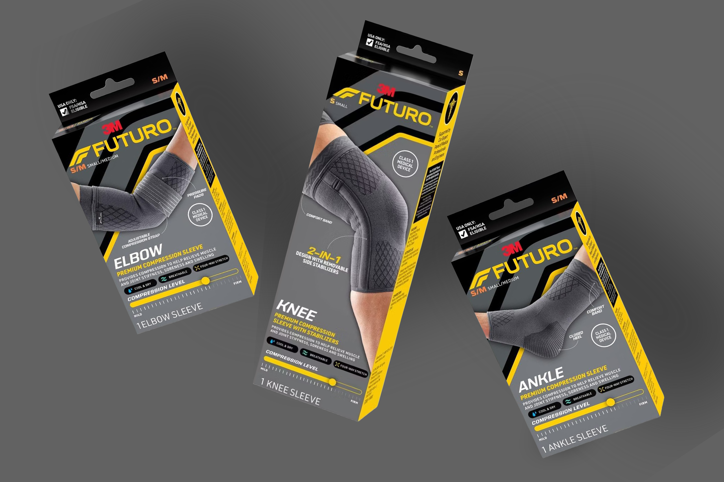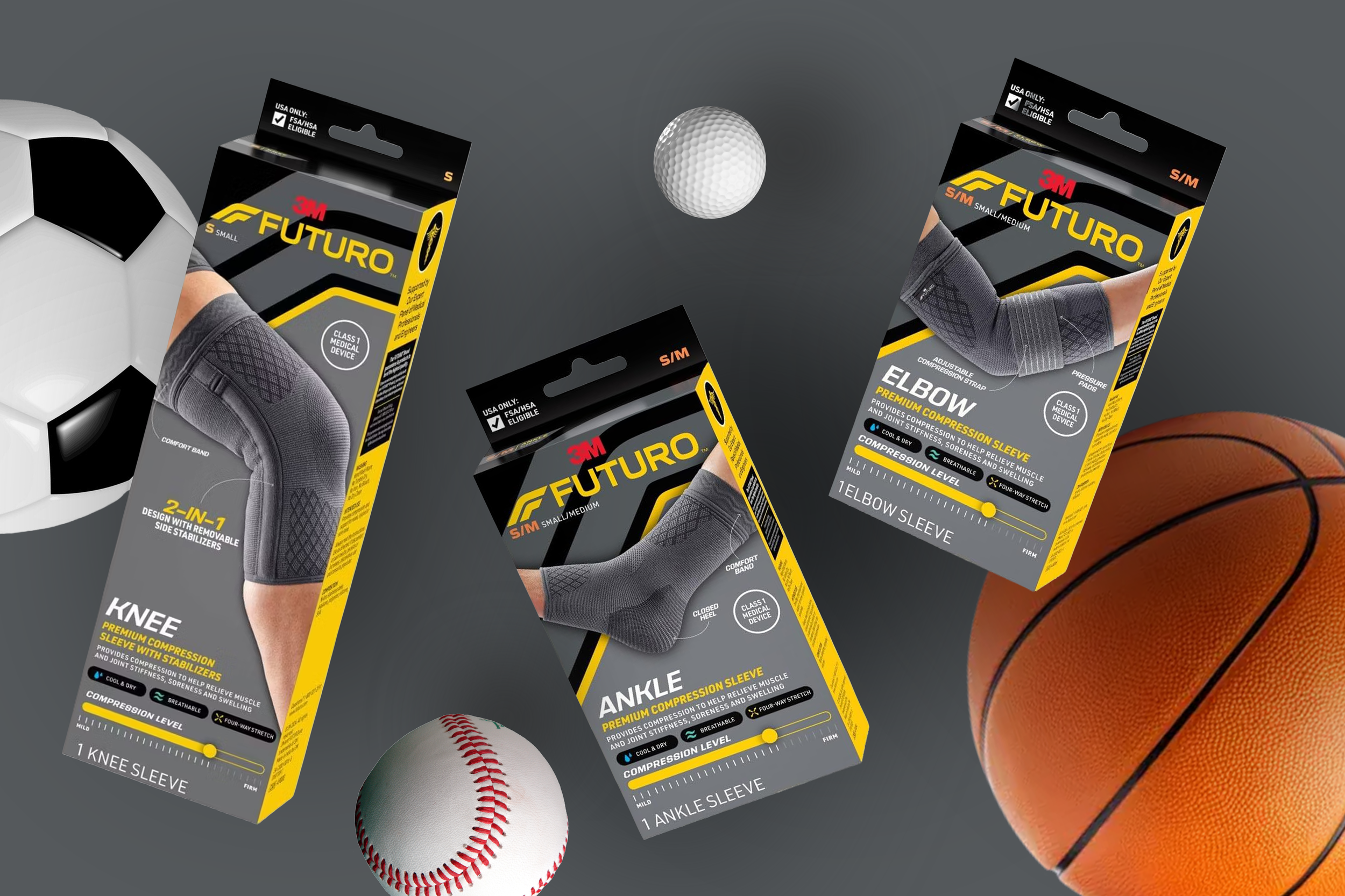
The packaging redesign aimed to keep recognizable elements of the Futuro packaging, while redesigning iconography and packaging communication to aid in portfolio navigation.
We kept the Futuro logo, the recognizable angled texture, and the iconography. The size placement and usage of large imagery we determined was important to keep consistent.
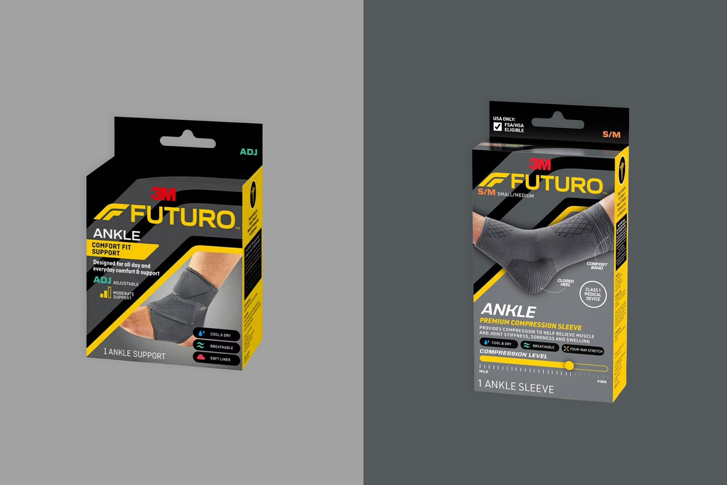
Our team created a packaging architecture with clear hierarchy to aid navigation to key elements, such as product size, logo placement and dynamic product imagery. Due to the nature of these new products there needed to be more communication on the packaging, so a new hierarchy of text had to be established.