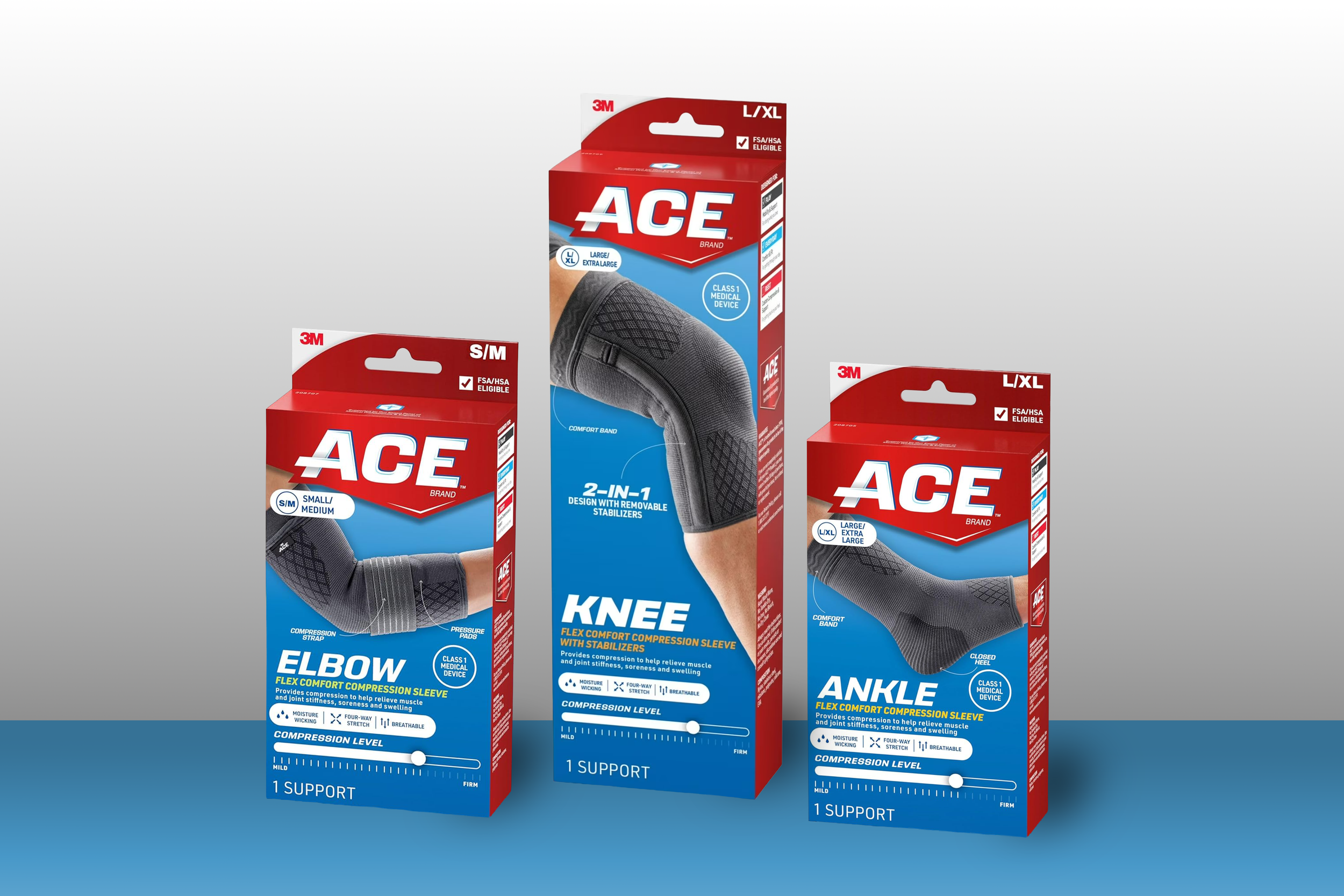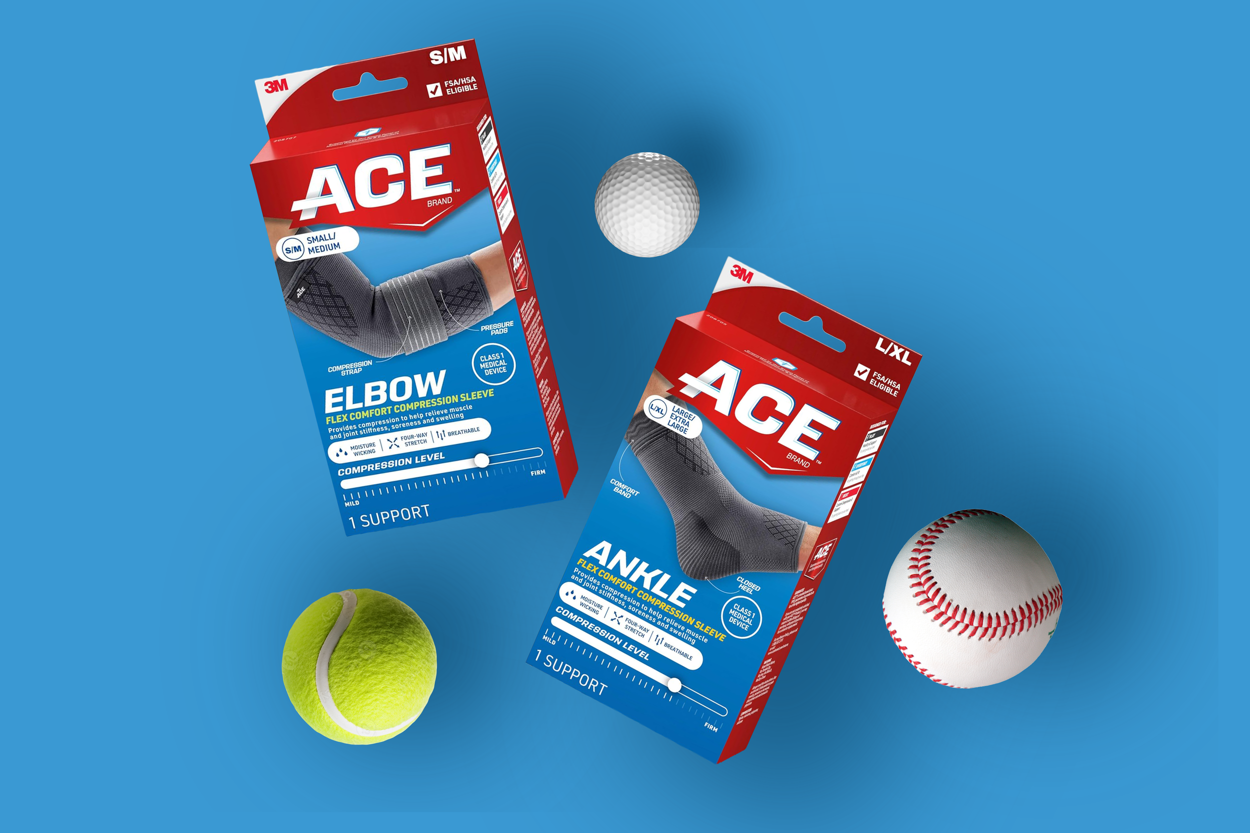
The packaging redesign aimed to keep recognizable elements of the ACE packaging, while redesigning iconography and packaging communication to aid in portfolio navigation.
We kept the ACE logo, but modified it to decrease the gradient level. The size placement and usage of large imagery we determined was important to keep consistent.
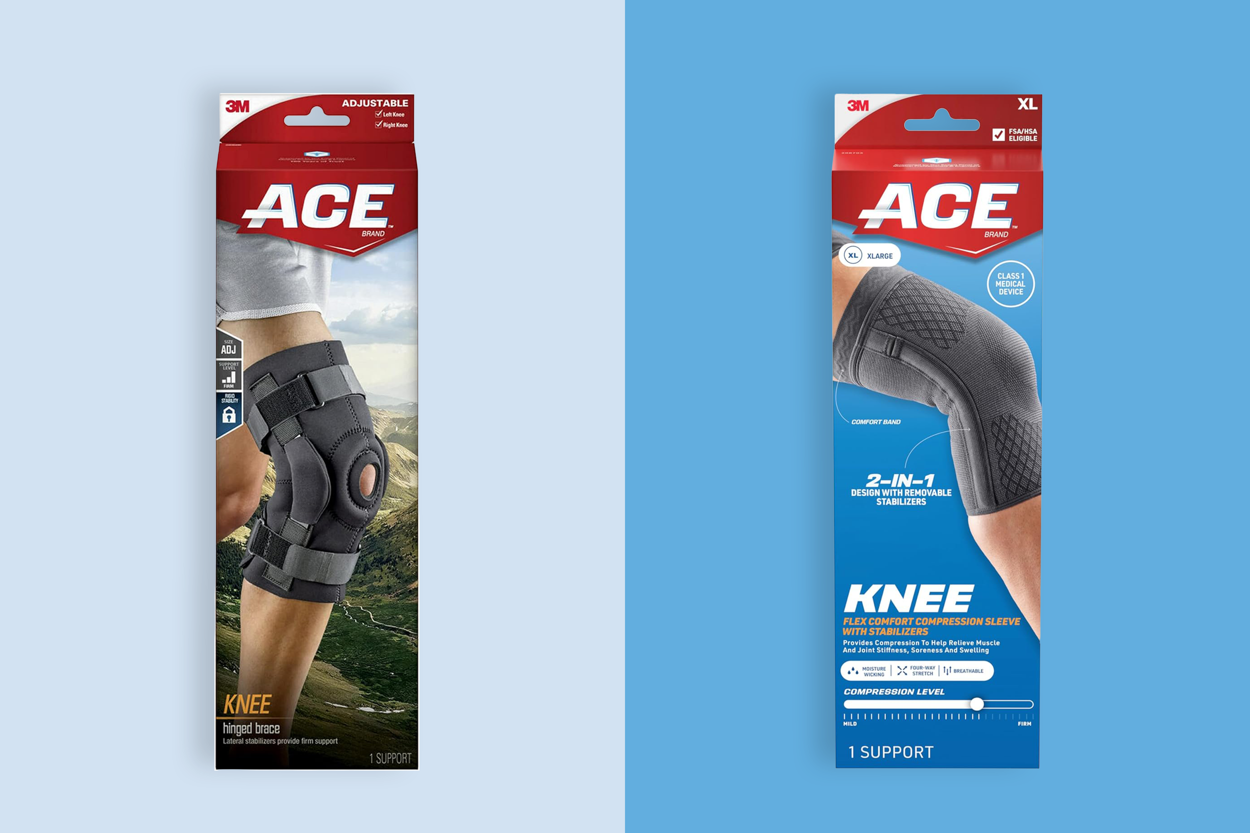
Our team created a packaging architecture with clear hierarchy to aid navigation to key elements, such as product size, logo placement and dynamic product imagery. The background drew inspiration from a blue sky which invoked the feeling of freedom and closely related to the landscape imagery utilized on past packaging while giving it a fresh look that drew attention on the shelf amongst the bright packaging.